
Our Mid Century Glass House Renovation: The Kitchen + Dining Room
When we first bid on this house in 2020, we were one of something like 40 couples who were seriously considering buying it. The bidding war was silent, but intense, and we ultimately lost it to a nameless, faceless couple who outbid us by only a few thousand dollars (crushing).
So, imagine our surprise when, months later, we got an email from our agent that said something along the lines of “the original couple walked and would you still be interested in buying the house.” We responded with a cool “yes absolutely are you kidding me,” and immediately felt a wave of gratitude alongside the weight of the responsibility to do right by the house we were lucky enough to call ours.
When we closed on the house and began the process of renovation, we made a commitment to honor Don Wrobleski, the home’s architect and sole owner, in every decision that we made. If we were to make any changes, they had to be in line with the original design and materials that Don chose. And if changes were necessary, we committed to mimicking Don’s decisions or elevating them in the best way we could.

The original kitchen was laid out galley style, but was open on one side to the dining room, utilizing high cabinets to create separation in the two spaces. The cabinets were quarter-sawn elm and surfaced with butcher block and travertine.
At the west end of the kitchen, another wall of glass looks into the west courtyard, letting in polygons of light that move across the kitchen throughout the day.

At the east end of the kitchen, tucked into the back side of the chimney stack, Don had incorporated a bank of cabinets with an integrated indoor grill, under a custom hood in black, with a matching black countertop.

Though the entire kitchen needed to be gutted, we maintained the same galley shape — we just ditched the two-tiered countertop in favor of opening up the kitchen to the dining room. Since the original cabinets were wood and flat-paneled, we, too, opted for oak slab panels— many of which are faced with black linoleum. In lieu of hardware, we chose minimal round handles — an homage to those round handles that became iconic in Scandinavian kitchens of the mid-century. Finally, we topped the counters with a custom terrazzo that brings in the blacks, yellows, and pinks of the color palette we used throughout the house.
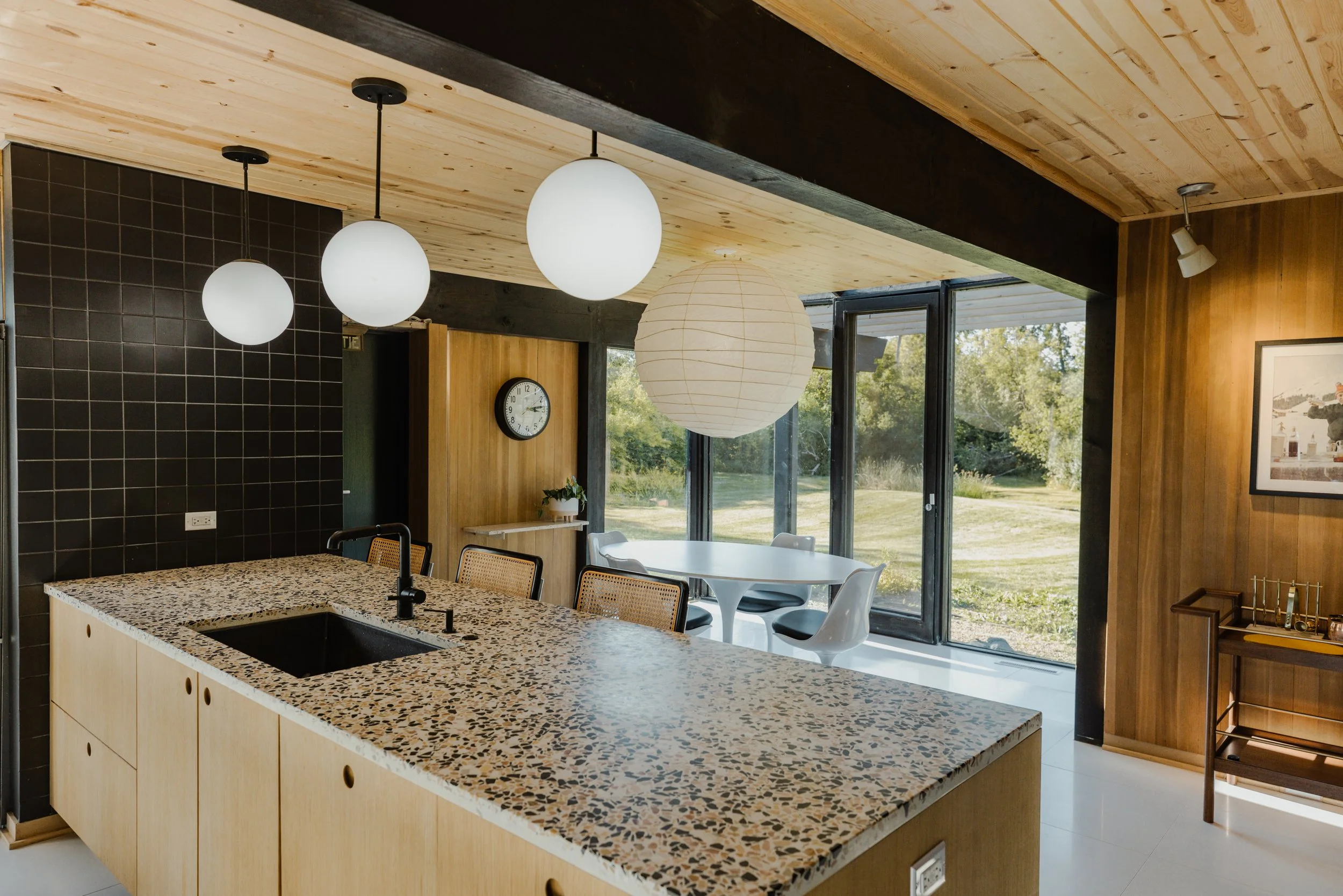
We carried the terrazzo up as the backsplash of our back cabinets where Don had originally incorporated a simple, translucent panel. While this cut back the light that the kitchen receives, the floor to ceiling windows of the kitchen and dining room do a lot of the heavy lifting (along with the three globe pendants we hung over the counter).

We replaced the aged Vermont slate floors (that had become a safety hazard) with Italian white terrazzo, and added under-counter seating as well as three Cesca chairs.

Though we loved Don’s creativity in adding a grill in the kitchen, we knew we wouldn’t make much use of it. We originally opted for a pizza oven, but after complications, we decided to create extra storage, a hidden coffee bar, and double ovens.

At the end of the island, there is a dividing wall just before the fridge and pantry cabinets. Here, Don originally painted the wall black. While we appreciated the simplicity of that (we certainly didn’t want to add anything that would compete with the busy terrazzo of the counters and backsplash), we wanted to elevate the wall in some way. So, we added matte black Fireclay 4x4 basalt tiles. They’re handmade in small batches, so they have a silky feel and add a warmth to the space that a painted wall could never.

The dining room got a bit of a facelift as well. The alpine terrazzo really brightens up the scene along with the 36” akari light sculpture that hangs over the Saarinen-inspired, oblong tulip table and chairs. It’s one of our favorite places to gather in the entire house. We’re often joined by a herd of deer or a rogue blue heron when we do.

Finally, we added an art deco exit sign (originally hung in a Montréal theater) over the doors that lead to our screened-in porch. Admittedly, the sign doesn’t fit the era, but it’s a joy to see it lit up at night, so just let us have this one.
